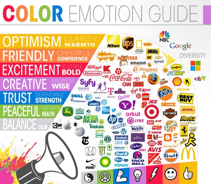
Colour plays a significant role in how your brand is perceived. No matter what business you are in, you can study the psychology behind colour choices to help you better attract and connect with your ideal demographic. The most successful companies strengthen their branding by selecting colours that match the emotions they would like to evoke.

Image Credit: Huffington Post
So what colour best aligns with your brand?
Understanding the meaning of the following colours:
Red
Red is one of the boldest colours on the colour spectrum. The colour is commonly associated with excitement, passion, danger, energy and action. Gaming systems such as Nintendo and toys such as Lego play on that bright and youthful connotation. Red has also been proven to trigger one’s appetite. Coca-Cola, Lays, KFC, Dairy Queen, and Skip The Dishes have used this to their benefit.
Orange
Orange is known for projecting a cheerful, fun, creative, friendly, and adventurous personality. A vibrant colour, orange is representative of confidence. The colour orange adds a bit of fun to any marketing material, picture or website it is on. Although it is not as commanding as the colour red, many marketers will use the colour for call to actions or areas that they want to draw the eye to.
Well-known motorcycle company, Harley Davidson, effectively uses orange to convey its adventurous nature. Home Depot sells products you can use for your home and they use orange to play off its creative aspect.
Yellow
Yellow is often times considered one of the brightest and most energizing colours. It’s often associated with happiness, warmth, positivity, and curiosity. Think summer time!
Green
In colour psychology, green is highly connected to nature, peace, growth and health. At Vector Shoppe Printing we use green as a representation of growth and our commitment to environmental and corporate social responsibility. Whole Foods uses green as a representation of its dedication to providing healthy, organic produce and food options.
Blue
The colour blue ties closely to stability, harmony, peace, calm and trust. These are just some of the feelings your customers may feel about your brand when you integrate the colour blue into your branding. You will find many social media platforms such as Facebook, Twitter use blue to showcase their platform as reliable and inviting.
Purple
Purple is a royal colour. The colour meaning for purple suggests power, luxury, wisdom and spirituality. But it can also be one of those colours that’s overuse can have a negative effect. Like Yahoo, purple is best used as an accent colour.
Grey
Grey signifies balance, neutrality and calmness. Its colour psychology likely comes from being the shade between white and black. It is commonly used in corporate design to evoke a sense of professionalism such as in the brand Apple. Apple’s website uses contrast of white and black to help maintain their clean and neutral look. Another example is Wikipedia who strives to be an objective and balanced online encyclopedia.
Black
Black is a popular colour in the retail world. In colour psychology, black symbolizes mystery, power, elegance, timelessness and sophistication. Many fashion designers use black in their logos such as Armani and Chanel. Nike also uses a black, white and grey colour scheme as it makes for an easy to read website that draws visual emphasis to call to actions or to add an item to your cart buttons.
White
White showcases innocence, goodness, cleanliness, and humility. However it is important to keep in mind that this is the meaning in North American culture. In some countries it may have the opposite meaning so it is always important to take into consideration the target demographic that you serve. Many brands who have white as a central colour tend to pair it with black or grey as it gives that minimalist, modern look.
Contact Vector Shoppe today To Include Color Psychology In Your Brand
There are many variables to consider behind colour choice! There’s always a chance that various people perceive colours differently. How you perceive a certain colour may have a lot to do with your experiences in the past, personal preference, culture, gender, etc.
Now that you have learned what colour psychology is and what emotions each colour commonly evokes, it’s time to apply them to your business.
#vectorshoppe
#printmoreplantmore


Many thanks very useful. Will certainly share site with my good friends.
Really appreciate it Brianplone! Thank you.